Nehaj Biddyaloy is a philosophy-based knowledge hub that aims to bridge deep intellectual thought with societal and national development. Rooted in the Arabic word Nahaj—meaning “path” or “method”—the name embodies a disciplined yet boundless approach to human potential.
When Nehaj Biddyaloy approached Braille Design for a rebranding, the challenge was to translate their profound philosophical values into a distinctive, modern, and timeless visual identity. This case study documents our creative exploration, with Concept 1 emerging as the final selected design.
Philosophical Core
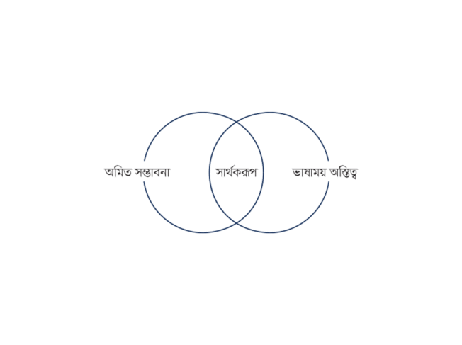
The essence of “Nehaj” lies in recognizing and nurturing the innate potential within each individual—what they describe as the language-filled self. This potential is not bound by rigid constraints but flourishes within a structured, disciplined framework. The philosophy emphasizes:
Our challenge was to visually express this balance between the abstract and the structured, the personal and the communal.
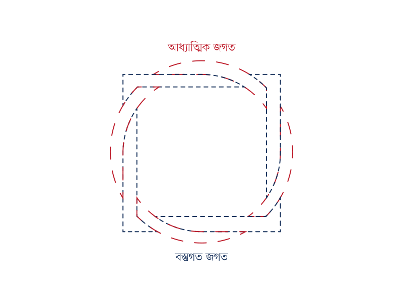
Concept 1: Infinite Potential & Structured Learning (Final Selection)
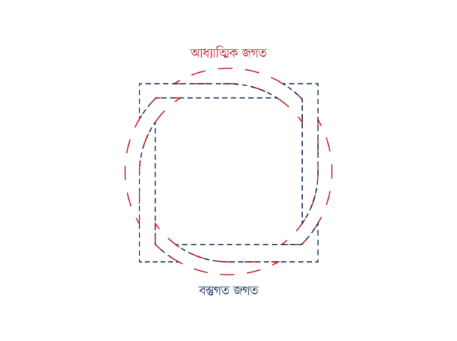
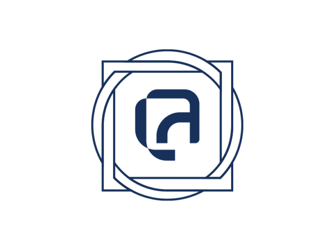
The design merges the circle (symbol of infinity, spirituality, and completeness) with the square (symbol of structure, rationality, and modernity). Together, they form a metaphor for Nehaj Biddyaloy’s role in connecting limitless human potential with the discipline of structured learning.
The final identity is both a philosophical statement and a functional brandmark. It positions Nehaj Biddyaloy as a place where structured learning nurtures infinite human growth.
A harmonious union of infinity and structure—where the limitless potential of the human mind meets the disciplined path of learning.
Concept 2: Individuality Within Community
Concept 2 builds its foundation on a grid structure symbolizing the collective framework of society and education. Within each grid unit lies a unique geometric element, representing individuality.
This concept highlights Nehaj Biddyaloy as both a nurturer of collective wisdom and a cultivator of personal identity. While visually strong, it was not chosen as the final because it leaned more toward community structure than the institution’s philosophical duality of infinity and discipline.
A celebration of uniqueness within a shared framework—honoring individuality while nurturing collective wisdom.
Concept 3: Structured Knowledge & Intellectual Discipline
Concept 3 takes the grid framework further, incorporating a pattern of structured, layered shapes. This design focuses more on discipline, order, and intellectual pursuit.
This approach positioned Nehaj Biddyaloy as a highly disciplined, knowledge-driven institution. However, it lacked the emotional and symbolic depth of Concept 1’s infinite potential narrative, making it less aligned with the brand’s aspirational vision.
A disciplined grid of thought—where order forms the foundation for creativity to emerge.