SHOWCASE
- Home
- Crafting a Digital Sanctuary for Intellectual Discourse
Crafting a Digital Sanctuary for Intellectual Discourse
UI/UX Design
Project Scope
Nehaj Bidyaloy is not merely a publication; it is a school of thought. The name “Nehaj,” derived from the Arabic “Nahaj” (meaning method or path), represents a dedicated, immersive approach to seeking truth through reading, thinking, and discourse. Our challenge at BRAILLE was to architect a mobile-first digital experience that embodied this profound philosophy.
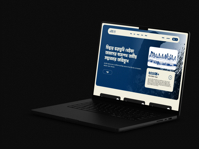
The platform needed to be more than a blog or a content repository. It had to be a serene, intuitive, and dignified digital space that could host a vast library of essays, translations, and notes across diverse subjects like Thought, History, Literature, Art, Cinema, and Theology. The primary goal was to create an interface that receded into the background, putting the deeply intellectual and often poetic Bengali content at the forefront, while ensuring effortless navigation for a growing community of over 500,000 regular readers.
Our Approach: A Philosophy-Led Design Process
We began by deeply internalizing the core tenets of Nehaj:
- "Nehaj kore jante hoy" (One must know through Nehaj): The design must facilitate deep, uninterrupted engagement with texts.
- Focus on Potential: The interface should feel expansive, reflecting the "amit shombhabona" (immense potential) within every individual.
- Structural Integrity: The vast and categorized content required a robust information architecture that felt simple to the user.
Our process was built on these pillars, translating abstract concepts into concrete design principles.
The Solution: A Harmonious Blend of Elegance and Functionality
The final UI design is a testament to a minimalist philosophy, where every element serves a purpose.

1. A Cohesive and Symbolic Visual Language
- Color Library: We developed a sophisticated color palette anchored in a deep, trustworthy Dark Blue as the primary brand color, representing depth, loyalty, and intellectual rigor. This is complemented by an Ivory White for backgrounds, ensuring optimal readability and a clean, paper-like aesthetic. Accents of Golden Beige were introduced for elegance, with a full spectrum of supporting grays and alert colors for a dynamic yet cohesive system.
- Typography Library: A clear, hierarchical typography system was established. It guides the reader seamlessly from prominent H1 headings down to subtle UI labels, ensuring content is scannable and enjoyable to read for extended periods. The choice of fonts prioritizes clarity and a literary feel.
- Structural Integrity: The vast and categorized content required a robust information architecture that felt simple to the user.
2. Intuitive User Interface (UI) Design
- Streamlined Navigation: A persistent, easy-to-access bottom navigation bar allows users to effortlessly switch between major sections: Bishoy (Subject), Proborno (Essay), Notesh (Notes), Onubad (Translation), and more.
- Content Discovery: We designed clear pathways for users to explore "Sorbochesh Pothito" (Most Read) articles and browse the "Shomosto Lekha" (All Writings) archive. The category pages for each subject are clean and content-focused, with prominent cards for featured articles.
- Reader-Centric Layouts: Article pages are designed for immersion. Ample whitespace, comfortable line lengths, and clear typographic hierarchy reduce cognitive load, allowing readers to focus entirely on the text.
3. Mobile-First Excellence
Understanding that knowledge consumption happens on-the-go, the entire design was conceived for mobile. Touch targets are appropriately sized, scrolling is smooth, and the layout adapts flawlessly across different screen sizes, providing a consistent and premium experience for every user.
"The team at BRAILLE understood the soul of Nehaj from our first conversation. They translated our abstract philosophical mission into a digital interface that is not just functional, but inspirational. It feels like a true 'Bidyaloy' (place of learning)." — Nehaj Bidyaloy Team

The Result: A Digital "Bidyaloy" True to Its Name
The collaboration between BRAILLE and Nehaj Bidyaloy resulted in a mobile interface that is:
- Philosophically Aligned: The design authentically reflects the intellectual seriousness and poetic nature of the Nehaj brand.
- Highly Usable: The intuitive navigation and clean layout make exploring a vast knowledge base a simple and engaging experience.
- Visually Stunning: The elegant color scheme and thoughtful typography create a digital environment that is both beautiful and respectful of the content it holds.
- Scalable: The structured design system allows Nehaj to continue growing its content library without compromising the user experience.
The Nehaj Bidyaloy project was a profound reminder that exceptional design is not about decoration; it is about translation. Our mission at BRAILLE was to translate a rich, philosophical ethos into a silent, intuitive, and empowering digital framework. The resulting mobile interface is more than a website—it is a carefully architected gateway designed to facilitate discovery, encourage deep contemplation, and honor the weight of the ideas within.
Conclusion
By prioritizing clarity, elegance, and user-centricity, we succeeded in creating a digital sanctuary that stays true to Nehaj’s core principle: that the path to knowledge (“Nehaj”) itself must be clear and unobstructed. The platform now stands as a testament to how thoughtful design can elevate intellectual discourse, proving that technology, when guided by purpose, can become a powerful ally in the pursuit of understanding.
This project is not an endpoint, but a foundation. As Nehaj Bidyaloy continues to grow and inspire its community of readers and thinkers, the scalable and robust design system we built will ensure the experience remains as profound and engaging as the content it presents. We at BRAILLE are proud to have crafted a digital home worthy of Nehaj’s vital contribution to the world of ideas.